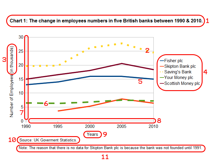
Chart/Line graph vocabulary exercise

Along with tables, one of the most common methods of presenting/showing data to people is in a line graph/chart. By displaying data in a visual way, it makes the data easier for people to understand. This is the reason why graphs/charts are used in business presentations, reports etc...

In this online exercise, we will look at the English names of the different parts of a line graph/chart (e.g. the different types of lines). Knowing this vocabulary is important when either describing or explaining a graph/chart to people.


Exercise: The names of the parts of a line graph/chart

In the below line graph about the changes in the number of employees in British banks, you will find that the different parts are either surrounded/enclosed by a red line with a number in red or just have a red number next to them. These red numbers are used below the chart to confirm the name of each part (e.g. 1 = title).

Focus on the names of these different parts and then do the quiz at the end to check that you both understand their meaning and remember them.

British Banks Line Graph
  • 1 = title
  • 2 = dotted line
  • 3 = unit of measure
  • 4 = key
  • 5 = line
  • 6 = dashed line
  • 7 = vertical axis
  • 8 = horizontal axis
  • 9 = axis title
  • 10 = source
  • 11 = footnotes


Quiz: Chart/Line graph vocabulary

Below is a definition/description of each of the different parts of the line graph which is shown above. Now fill in the blanks with the name of one of these parts which are in bold in the above list. Only use one word/phrase once and write it as it is in the list. Click on the "Check Answers" button at the bottom of the quiz to check your answers.

When the answer is correct, two icons will appear next to the question. The first is an Additional Information Icon "". Click on this for extra information on the word/phrase and for a translation. The second is a Pronunciation Icon "". Click on this to listen to the pronunciation of the word/phrase.

1. On a graph, this '      ' is called a    


Line:
(noun) A 'line' is used to show the changes in data over time or by some other variable. Although it is more accurate to call it a 'solid line', nobody does. In Spanish: "linea".

Close

Line:

Close

2. A graph/chart is made of a vertical axis and a    


Horizontal axis:
(noun) Graphs and charts (except pie charts) need at least one 'horizontal axis' and one 'vertical axis' where the values of the variables (speed, size, company name, year etc...) are placed. A 'horizontal axis' is also called a 'x-axis', but it is more common in both business and general English to call it a 'horizontal axis'. In Spanish: "eje horizontal".

Close

Horizontal axis:

Close

3. The place where the details of where the data/information in the graph comes from, is called the    


Source:
(noun) The 'source' is the organization/people who created and provide the data being used in a chart or table. For legal reasons, if the data is not yours, you must write the name of the source on any table or chart. The 'source' is generally located below the chart or table and is above any footnotes. It should start with 'Source:', e.g. 'Source: University of Birmingham'. In Spanish: "fuente".

Close

Source:

Close

4. In an axis title, this '(in millions)' is called the    


Unit of measure:
(noun) A 'unit of measure' is used in axis labels/titles to show what quantity the number on an axis represents, e.g. '(%)'. The 'unit of measure' is always placed inside of brackets'()' at the end of the axis title, e.g. 'Annual Profit (in millions of US$)'. If the 'unit of measure' is in words, then it often includes the preposition 'in' (see above). In Spanish: "unidad de medida".

Close

Unit of measure:

Close

5. On a graph, this type of line '-----' is called a    


Dashed line:
(noun) A 'dashed line' is one type of line used on a line graph to show changes in data over time or by some other variable. It is used with other types of lines (solid lines and dotted lines) on a graph to help people distinguish/recognize the different objects or things that are being analysed or compared. In Spanish: "linea discontinua".

Close

Dashed line:

Close

6. Extra information about the data in a table or chart, is written in the    


Footnotes:
(noun) The 'footnotes' or 'notes' is where extra information about any data in a chart or table is placed. A 'footnote' is useful for helping people to understand a chart or table better. 'footnotes' are normally located under the chart or table. You can write one or more 'footnotes', but each must be referenced/connected to the data it refers to by symbols ('*' etc...) or by font style ( 'italics', 'bold'), to avoid confusion and misunderstanding. In Spanish: "notas".

Close

Footnotes:

Close

7. The name or label of an axis, is also called the    


Axis title:
(noun) The 'axis title' or 'axis label' describes the variables (time, size, speed etc...) an axis is showing, e.g. 'Monthly revenue before tax'. It is used to help people understand a graph/chart better. Sometimes it is not necessary to use an “axis title” (especially on bar charts which are comparing different companies). In Spanish: "título del eje".

Close

Axis title:

Close

8. A section in graphs/charts that inform you what the lines mean/represent, is the    


Key:
(noun) The 'key' or the 'legend' is used in a lot of graphs/charts to help people who are reading them to know what objects/things the different lines are for/refer to. Normally, the 'key' gives an example of the type of line and its colour followed by name of the line, e.g. '····· Profit'. The 'key' is normally located to the right of the graph/chart. In Spanish: "leyenda".

Close

Key:

Close

9. The name of the table/chart, is the    


Title:
(noun) All charts/tables should have a 'title' which explains to the people reading it what the data/information it contains is. If a document or presentation contains multiple tables or charts, it is best to start the title with chart/table and different number and a colon (e.g. Chart 2:, Table 1:). This helps people to find/locate the different charts/tables. In Spanish: "título".

Close

Title:

Close

10. A graph/chart is made of a horizontal axis and a    


Vertical axis:
(noun) Graphs and charts (except pie charts) need at least one 'horizontal axis' and one 'vertical axis' where the values of the variables (speed, size, company name, year etc...) are placed. A 'vertical axis' is also called a 'Y-axis', but it is more common in both business and general English to call it a 'vertical axis'. In Spanish: "eje vertical".

Close

Vertical axis:

Close

11. On a graph, this type of line '·····' is called a    


Dotted line:
(noun) A 'dotted line' is one type of line used on a line graph to show changes in data over time or by some other variable. It is used with other types of lines (solid lines and dashed lines) on a graph to help people distinguish/recognize the different objects or things that are being analysed or compared. In Spanish: "linea de puntos".

Close

Dotted line:

Close


Practice

Now that you understand the new vocabulary, practise it by creating your own sentences with the new words/phrases.