Vocabulary for explaining & comparing chart data/trends exercise

Although it is essential to know how to describe the changes in the values of data on a chart (i.e. the increases and decreases) that are used in business reports or presentations, you also need to be able to explain and compare. With explaining, you need to be able to say what the lines/bars and chart represent, and also what the data means or demonstrates. In charts with multiple lines or bars, you will also have to be able to make comparisons between them.

In this online exercise on chart vocabulary in English, we will look at the vocabulary used to both explain and compare data and trends in graphs/charts. Although the focus here is on charts and graphs, much of the vocabulary can also be used for tables.

Exercise: Explaining and comparing a chart

Read the following presentation by a manager about the monthly sales of food and drink in a cinema. Focus on how the Manager explains and compares the data contained in the below chart.

Using the both context and the chart, try to guess what the meaning of the words/phrases in bold are. Then do the quiz at the end to check if you are right.

Food and Drink Sales in a Cinema

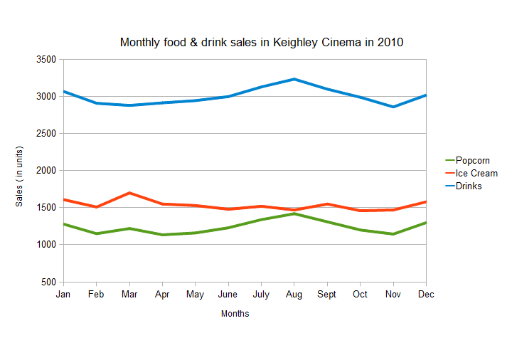
Manager:'The above chart shows the monthly food and drink sales in the Keighley cinema during 2010. The chart shows unit sales. As you can see, there are three lines on the chart. The sales of popcorn is represented by the green line. The blue line represents drinks. The red line represents ice cream. The chart demonstrates that drinks are by far the biggest type of food and drink sold in the cinema throughout the year.

The chart also shows that there is a correlation between popcorn sales and drinks. When popcorn sales rise, there is also a rise in the sales of drinks. This trend supports the theory that people drink more when they eat food that contains a lot of salt. During the summer, sales of drinks and popcorn showed a steady increase, by contrast, unit sales of ice cream actually fell slightly. In fact, sales of ice cream fell from April to July, falling from 1025 units to 821 units per month respectively. These result would seem to contradict the idea that people consume more ice cream during summer, because as we can see from the results there is no link.

Lastly, the results indicate that during the Christmas period of December to January, people are willing to spend more money. Sales of all three types of products went up during the period. But this could be due to a general increase in attendance at that time of year.'


Quiz: Vocabulary for explaining & comparing chart data/trends

Below is a definition/description of each of the words/phrases in bold from the above text. Now fill in the blanks with one of these words/phrases in bold. Only use one word/phrase once and write it as it is in the text. Click on the "Check Answers" button at the bottom of the quiz to check your answers.

When the answer is correct, two icons will appear next to the question. The first is an Additional Information Icon "". Click on this for extra information on the word/phrase and for a translation. The second is a Pronunciation Icon "". Click on this to listen to the pronunciation of the word/phrase.

1. Another way to say 'disagree with', is    


Contradict:
(verb) 'to contradict' is a professional way of saying 'to disagree with'. It is used when explaining data in charts to mean that the results do not agree with some theory, belief or idea, e.g. 'the results contradict the idea that higher taxes damage business, profits have actually risen'. Although it is useful to know this word, it is not commonly used in business. In Spanish: "contradecir".

Close

Contradict:

Close

2. A verb that is used to introduce and describe the purpose of a chart or table, is    


Shows:
(verb) 'to show' is used to introduce the content and purpose of a chart or table. Generally, when introducing a chart or table, you briefly describe it in one or more sentences, e.g. 'this chart shows the changes in the cost of oil in the last year'. Also 'to show' or 'to show that' can be used to mean 'to demonstrate/confirm/prove', e.g. 'the decrease in sales in July, shows that the weather does have an impact'. The context is important for both uses of 'to show'. In Spanish: "mostrar".

Close

Shows:

Close

3. A different way to say 'shows/confirms that', is   


Demonstrates:
(verb) 'to demonstrate' means that data/results on a chart or table confirms or proves an idea, belief or theory, e.g. 'the fall in sales in winter demonstrates that the weather does have an impact'. It is used to explain the meaning of the data/results. 'to show' can also be used with the same meaning, e.g. 'this shows that the strategy is working'. In Spanish: "demostrar".

Close

Demonstrates:

Close

4. A phrase that is used to show there is a difference in the results between two objects/things, is    


By contrast:
(linker) 'by contrast' is used when comparing two objects/things to say that they are opposites or very different in some factors/aspects, e.g. 'John is very tall, by contrast, his brother is short'. This linker is always followed by a comma, e.g. 'By contrast,'. In Spanish: "por contraste".

Close

By contrast:

Close

5. A different way to say 'represents', is    


Is represented by:
(verb) 'to be represented by' is used to describe what lines or bars on a chart signify/stand for, e.g. 'revenue is represented by the blue line'. This passive verb is used to help people understand charts better. 'to be represented by' has actually the same meaning as 'represents'. The difference between the use of the two depends on what is the subject and object of the sentence. With 'to be represented by', the name of the variable/thing goes in front of the verb and the specific line or bar goes after the verb, e.g. 'sales is represented by the blue line'. With 'represents', it is the other way around, e.g. 'the blue line represents sales'. In Spanish: "estar representado por".

Close

Is represented by:

Close

6. A verb that means that the data is making a strong suggestion, is    


Indicate:
(verb) 'to indicate' is used to say that data/results strongly suggest that an idea, theory or belief is right or wrong, e.g. 'the fall in sales during winter indicates that the weather does have an impact'. It is used in a similar way as 'to demonstrate', but 'to demonstrate' is used with the meaning of 'to confirm'. In Spanish: "indicar".

Close

Indicate:

Close

7. A word that is used to say to which object/thing two different numbers/words belong or refer to, is    


Respectively:
(adverb) 'respectively' is commonly used when comparing data (numbers/words) for two different objects or periods of time, e.g. 'there was an increase in sales for both cars and motorbikes, 15% and 20% respectively'. In this sentence the reader/listener will know that the 15% refers to cars and the 20% refers to motorbikes because of the word 'respectively'. It is always used after the data (numbers/words) at the end of the sentence. In Spanish: "respectivamente".

Close

Respectively:

Close

8. A word that means 'connection', is    


Correlation:
(noun) 'correlation' is a professional sounding word that means that there is a 'connection' or 'link' between items, objects or situations, e.g. 'there is a correlation between smoking and lung cancer'. The word 'correlation' is generally followed by 'between' and the two items/objects that are linked or connected (see the above example). In Spanish: "correlación".

Close

Correlation:

Close

9. A way to focus people's attention on a chart or table, is   


As you can see:
(phrase) 'as you can see' is used to focus people's attention on a chart/table or a part of it. It can be used for both introducing a chart and its parts and content or for describing changes and trends, e.g. 'as you can see, there are five different lines on the chart. The first is...' or 'as you can see profits fell in May'. In Spanish: "como pueden ver".

Close

As you can see:

Close

10. A way to say that something is a lot more important or bigger than other objects/factors, is    


By far:
(adverb) 'by far' is used when comparing different objects/factors. It is used to mean that something is a lot bigger or more important than other objects/factors, e.g. 'the twin towers were by far the tallest building in New York'. This phrase is always followed by the superlative (e.g. 'the most serious', 'the biggest'). Its main purpose is when you want to stress the importance of something to people, e.g. 'this is by far the biggest threat to our business'. In Spanish: "'muchísimo' con los superlativos".

Close

By far:

Close

11. A different way to say 'is represented by', is    


Represents:
(verb) 'to represent' is used to describe what lines or bars on a chart signify/stand for, e.g. 'the yellow dotted line represents revenue'. This verb is used to help people understand charts better. 'to represent' has actually the same meaning as 'to be represented by'. The difference between the use of the two depends on what is the subject and object of the sentence. With 'to represent', the specific line or bar goes before the verb and the name of the variable/thing goes after the verb, e.g. 'the blue line represents sales'. With 'to be represented by' it is the other way around, e.g. 'sales is represented by the blue line'. In Spanish: "representar".

Close

Represents:

Close

12. A phrase that means 'no correlation', is    


No link:
(noun) 'no link' means that there is no 'connection' or 'correlation' between items, objects or situations, e.g. 'there is no link between smoking and lung cancer'. The word 'link' is generally followed by 'between' and the two items/objects that are connected (see the above example). In Spanish: "no conexión".

Close

No link:

Close


Practice

Now that you understand the new vocabulary, practise it by creating your own sentences with the new words/phrases.